Brain Storm of ideas and concepts for
an affordable organic energy drink marketed
towards well-off twenty-year-olds.

10x10 grid of sketches for project concepts.


LO(W)CAL concept
This concept for a low calorie Organic energy drink consists of an octagonal aluminum can with informational
graphics designed for each panel of the can. The beverage is produced from high quality organic ingredients grown on privately owned local farms. In order to stay true to its name, Lo(w)cal will be produced regionally throughout the U.S. assuring all organic ingredients in the drink are locally grown.

Clarity concept
The design for the Clarity concept mimics the slender cylindrical design that has become a recognizable template for many energy drinks on the market. Unlike its competitors however, the container is produced from thin transparent plastic instead of aluminum, infusing both the product's name and its appearance into one. The name of the beverage also refers to the the clarity of ingredients contained within the drink, promising consumers that everything on the label is a product the masses could easily identify. A small silk sunflower adds visual appeal to the otherwise minimalist design, acts as the brands trademark, as well as providing a small souvenir for the consumer.
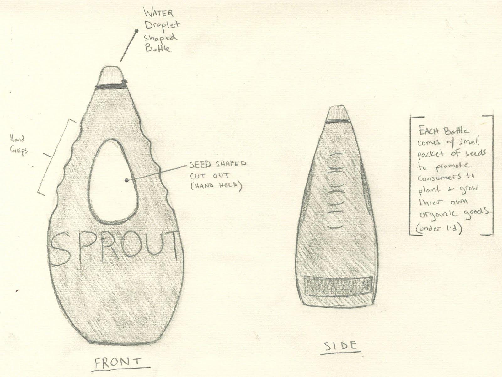
Sprout concept
The Sprout concept's design is based the teardrop shape often found in nature. The bottle features a seed shaped cutout through the upper central portion of the container, also acting as a handhold as indicated by the finger grips along the contours of the bottle. The concept behind this design is conscious of the audience most likely to consume organic products, and promotes the demographic by including a small packet of organic seeds with each energy drink, encouraging consumers to produce their own organic goods.
No comments:
Post a Comment